
Some SaaS with
Some Personality
“Could we please have some SaaS with some character and attitude?! Everything in this category seems to fall flat and un-energetic.”
I love it when a potential clients puts such a fun problem before me to address. The extra added bonus is when they love what you come up with. Honestly, this was one of the funest six week projects I’ve done. Not only did I need to address a visual creation issue, but also a practical one as well.
The Approach
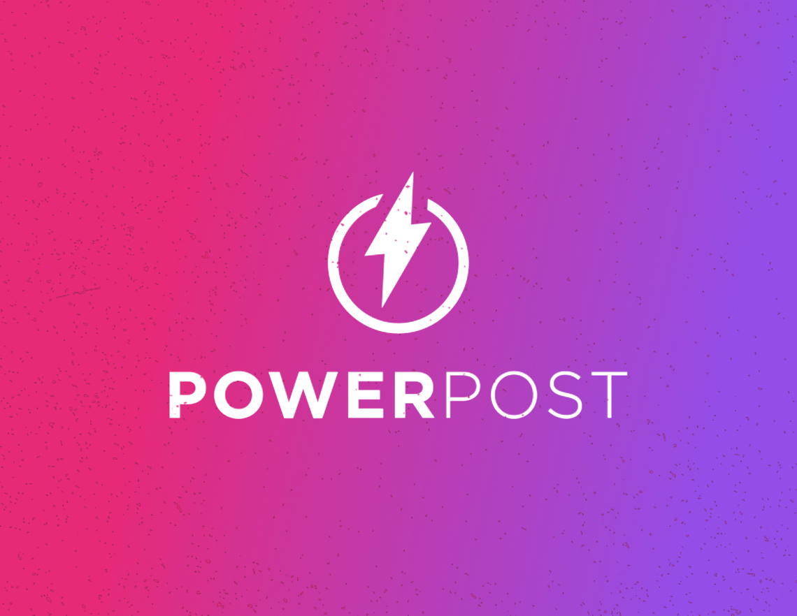
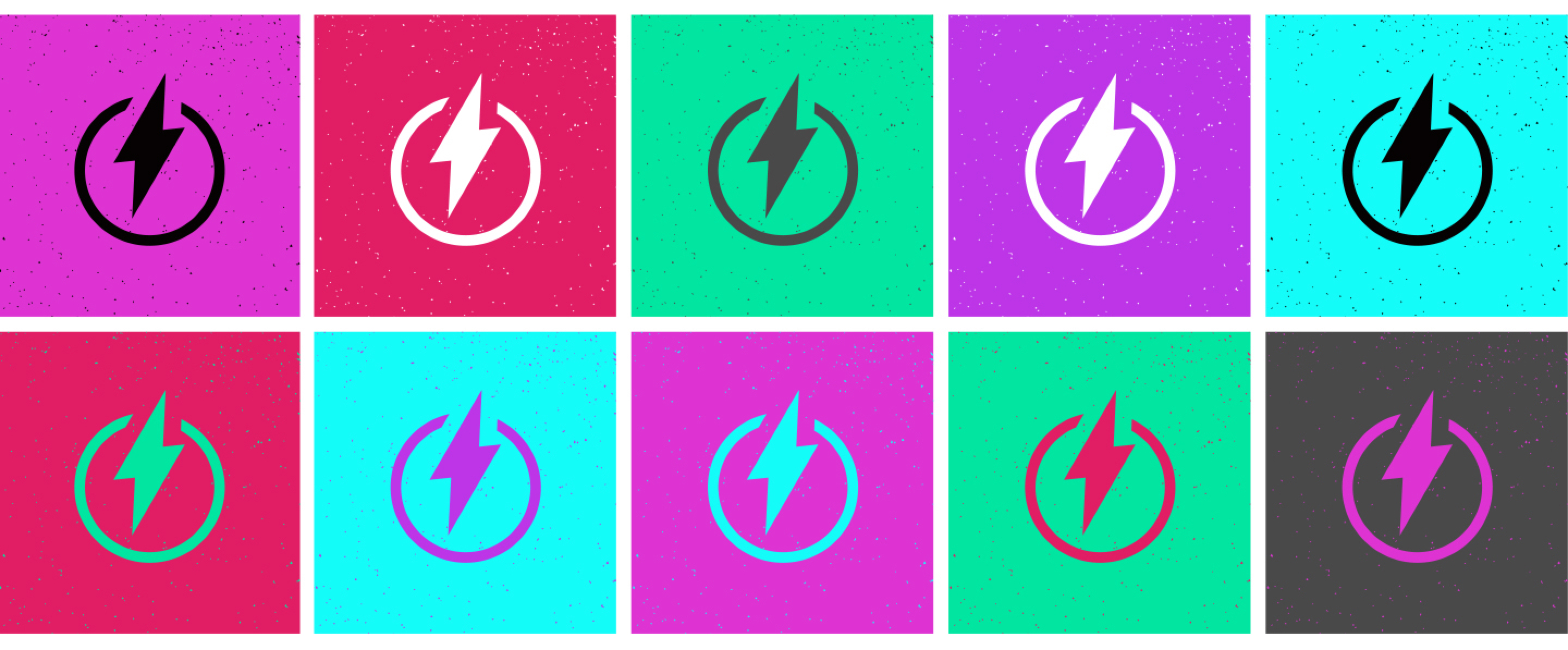
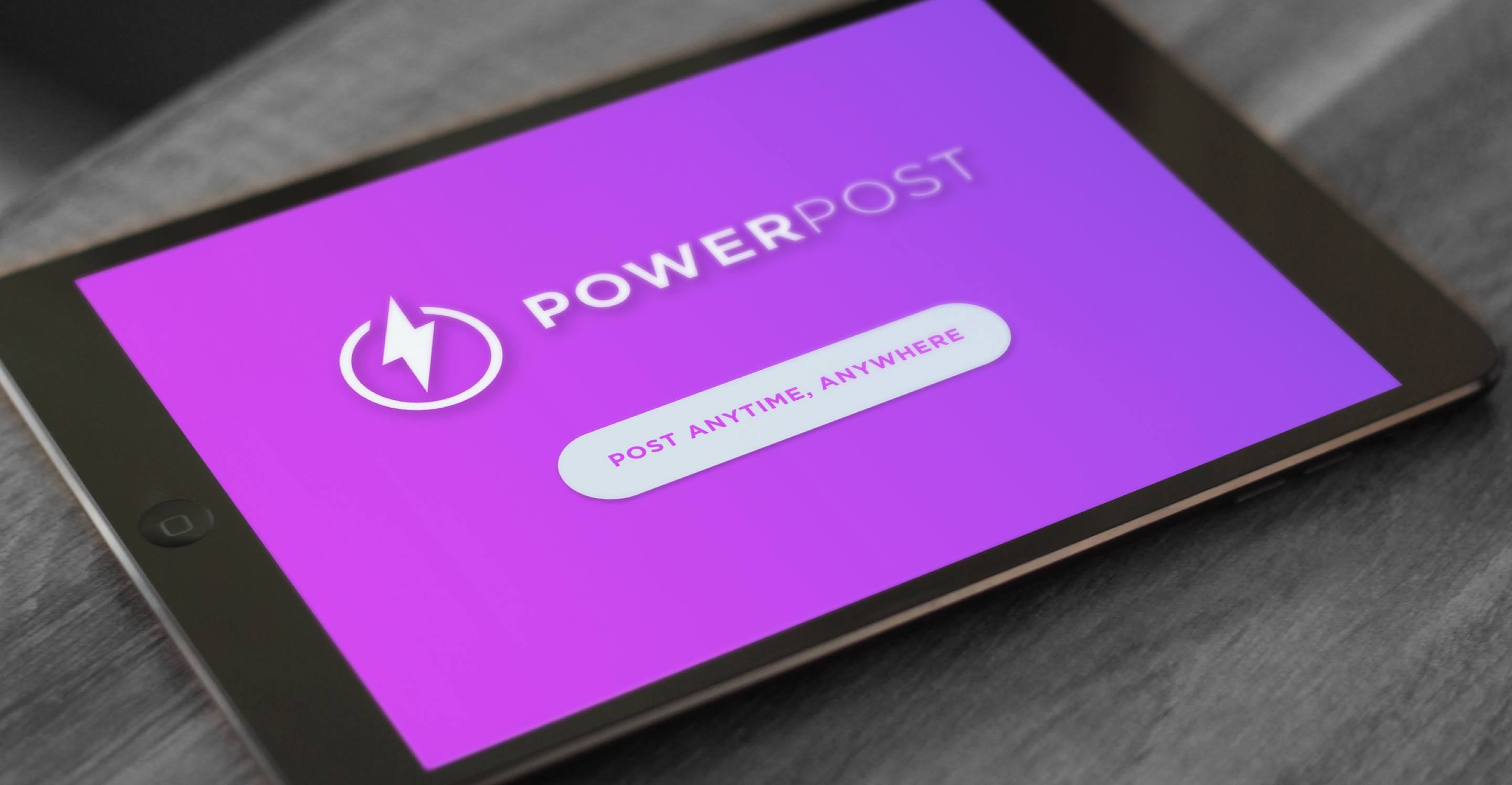
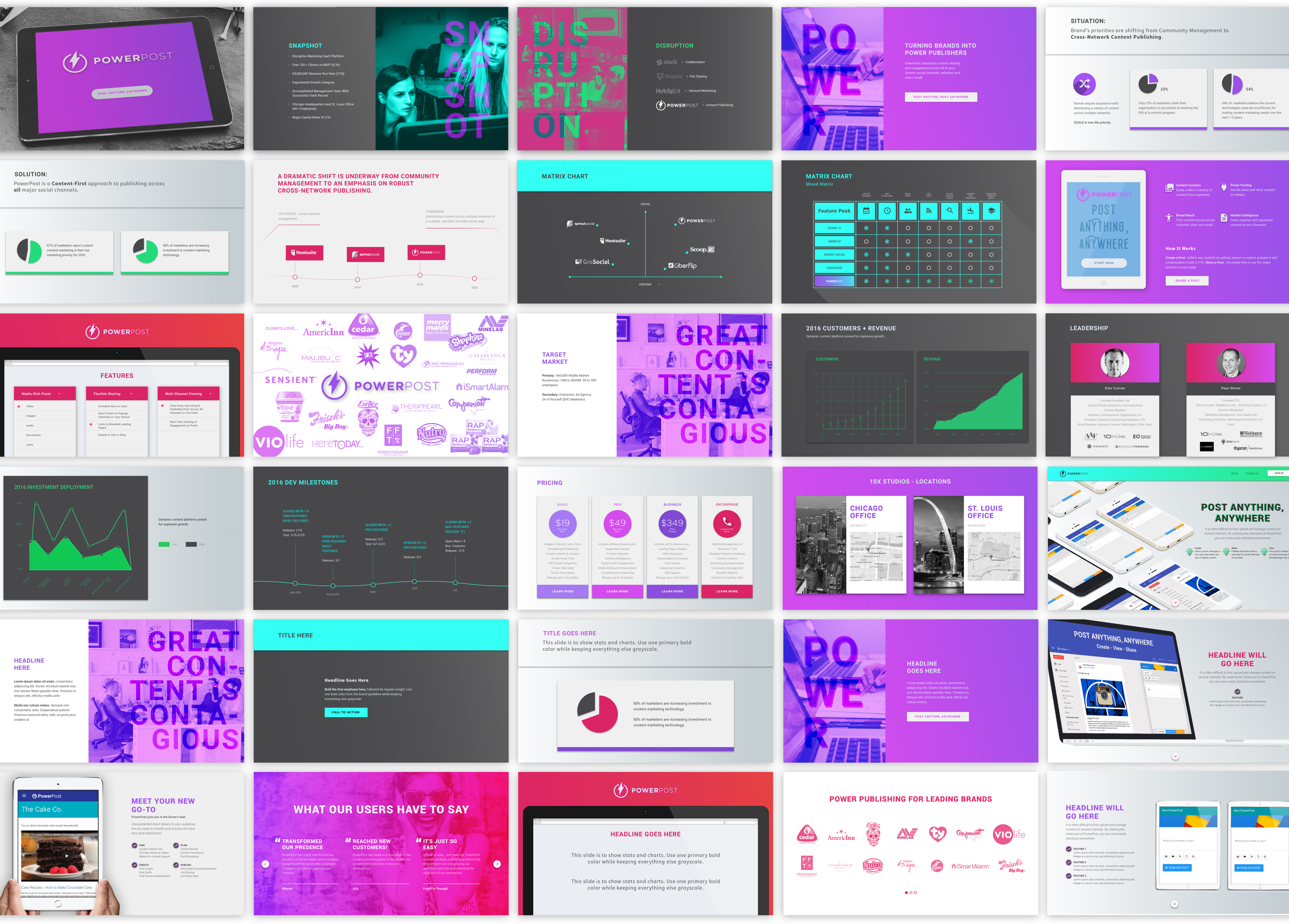
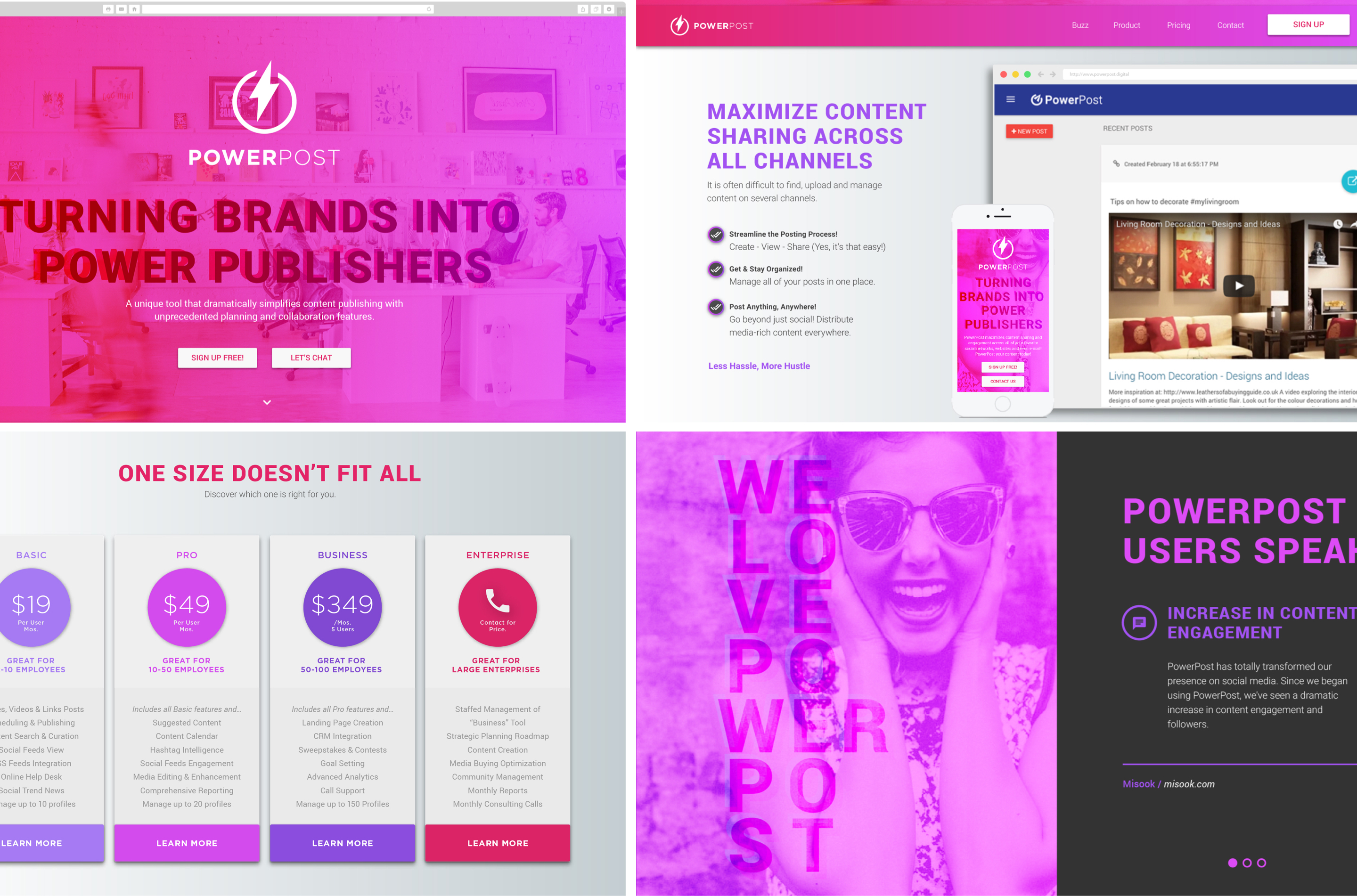
Color scheme + photos + clean design = Our PowerPost approach.
I typically go into these type of projects with this mindset, “How simple and subtle can I keep this and still deliver what the client needs/wants?” Sometimes, though, it doesn’t call for a subtleness. Sometimes it calls for the design to be LOUD. How to keep this inviting yet vibrant was part of the fun challenge. My first thoughts went to color. The overall aesthetics could be simple, but color, oh my the color, can really brighten up the tone of energy desired.
Through concepting identity, executing design for the investor deck, and carrying the culmination of all of this together for the marketing web site, let me dive in to these challenges.
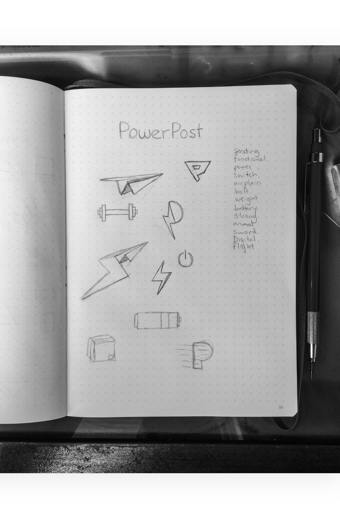
The Anatomy
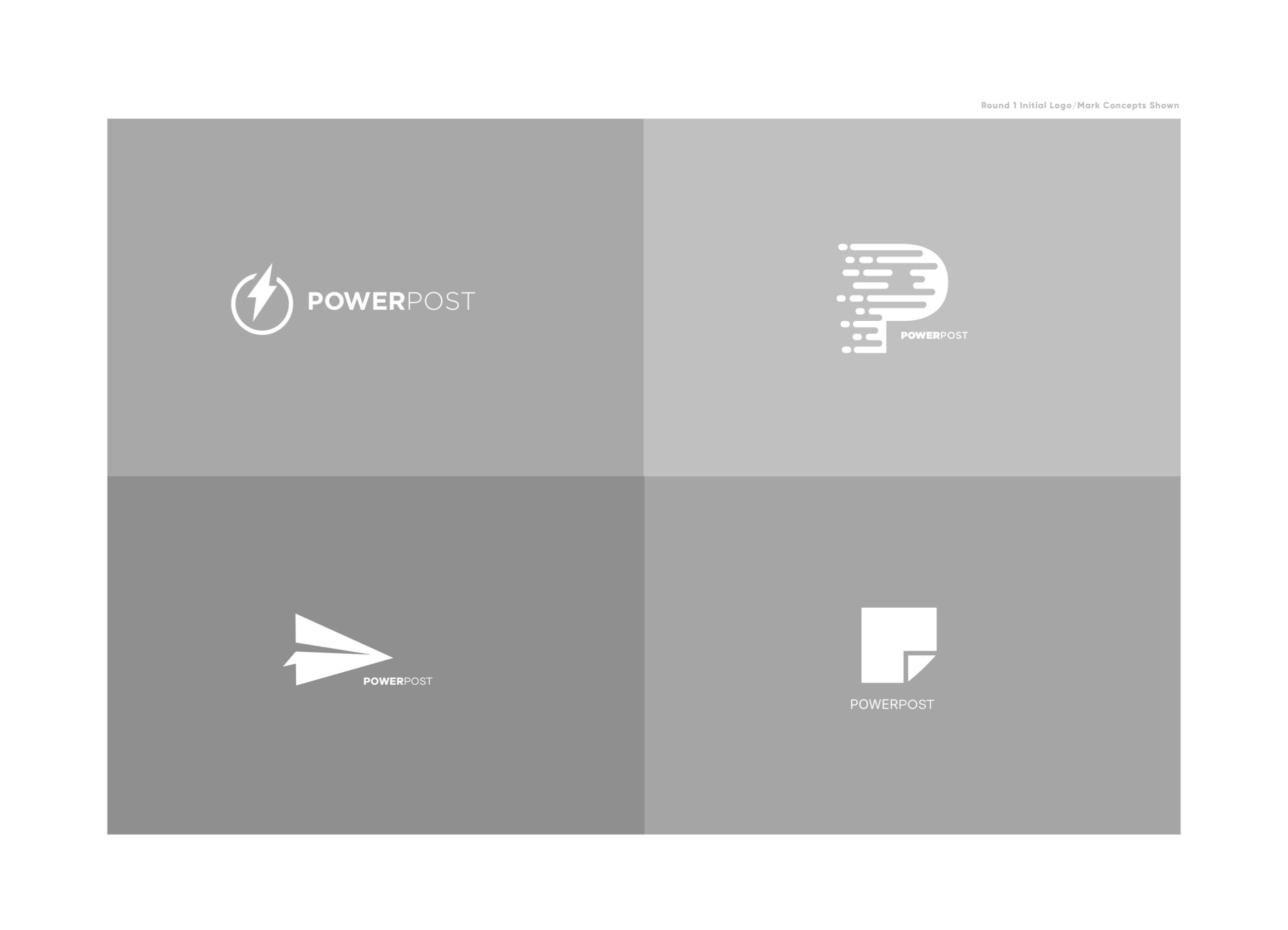
You may not be able to notice the system behind the mark, but you sure feel it when you see it. The balance and foundation of this simple mark help clearly showcase who PowerPost is. The vertical lines angles are consistent with one another as well as the horizontal lines that make up the bolt which helps complete the visual thought of a power button.
This mark is encased by a split circle at the top following the lines of the bolts showing motion and movement attacking at the heart of who and what PowerPost exists to do.

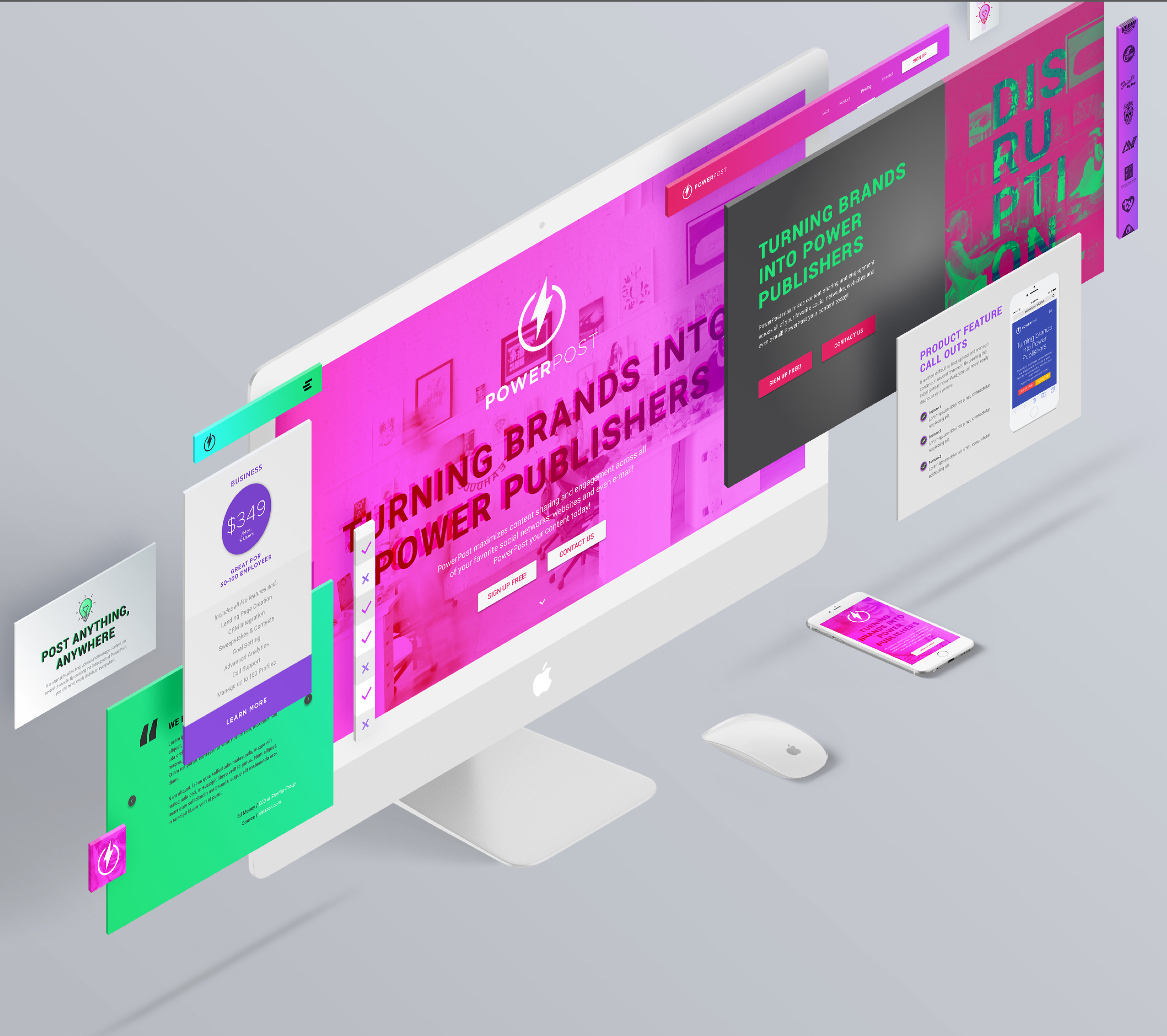
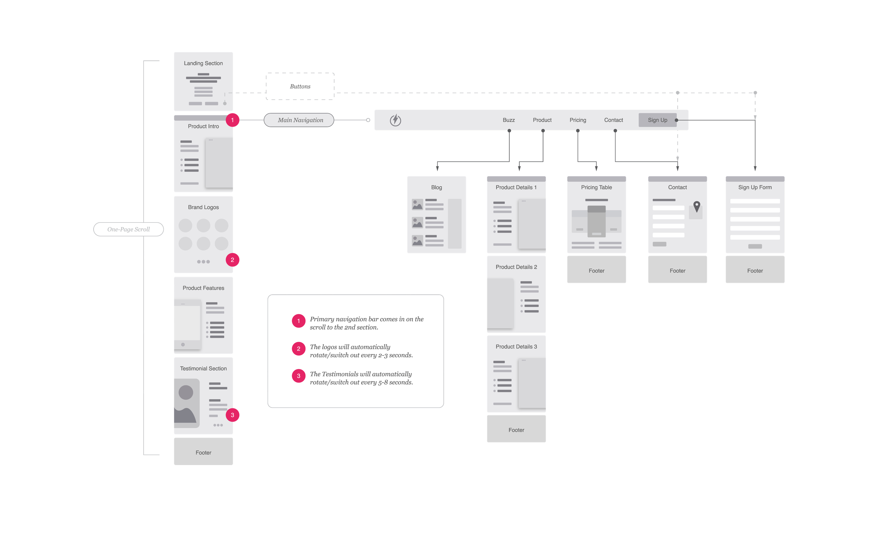
UI & UX DESIGN
In keeping with the momentum of the brand, I wanted to continue that energy through to the marketing website. The goal was to introduce the SaaS product in a clear way while supporting it with the visual tone I established. It also needed to look really good :zap:
"Everyone here is very happy with the overall design and branding you’ve come up with. We love the colors and the vibrancy that has come out of it.”
DAN CURRAN
CEO & FOUNDER - PowerPost
Scope of Work
Discovery & Strategy Services
Evaluation
Research
Concepting
Branding Strategy
Planning
Branding Services
Branding Strategy
Visual Identity & Assets
Lettering
Collateral
Brand Guidelines
Communication Services
Communications Style Guides
Messaging, Voice, & Tone
Internal Company Materials
Content Strategy & Production
UI/UX Design Services
User Flow Mapping
Content Strategy
Wireframing & Prototyping
Visual Design
Responsive Design
Copyright © Not to use without written permission by Stephen Politte (All rights reserved)
More Selected Projects
Subtrction is...
Subtrction is the personal design shop of Stephen Politte. I partner with the most talented writers, designers, and communication specialists to craft elegant solutions to your roadblocks from strategy to execution for brands, agencies, and start-ups.


FIND US HERE
stephen@subtrction.com
314-320-489(eight)
Medium
AWESOME STUFF
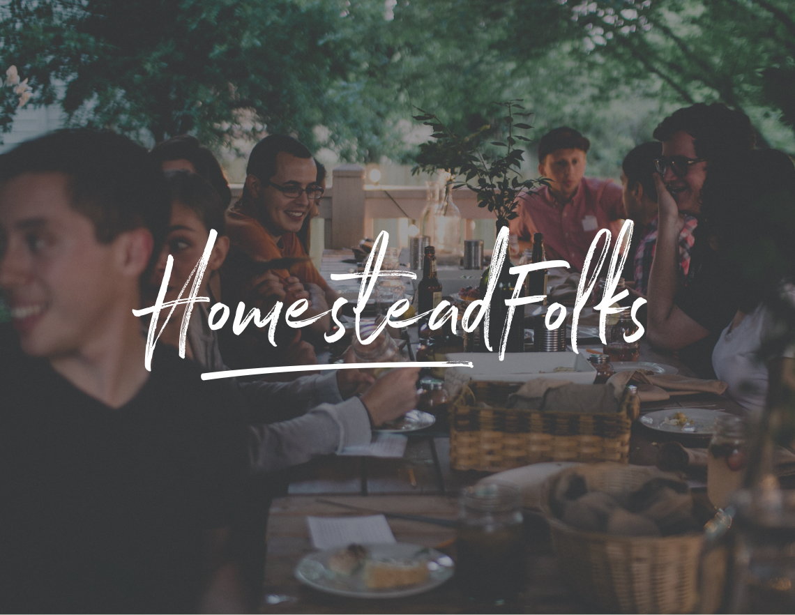
www.hooke.ca
www.homesteadfolks.com
The Power of Habit
STAY UP TO DATE
Sing up to receive updates on our latest work and thoughts.
© 2020 Not to use without written permission by Subtrction LLC or Stephen Politte (All rights reserved).