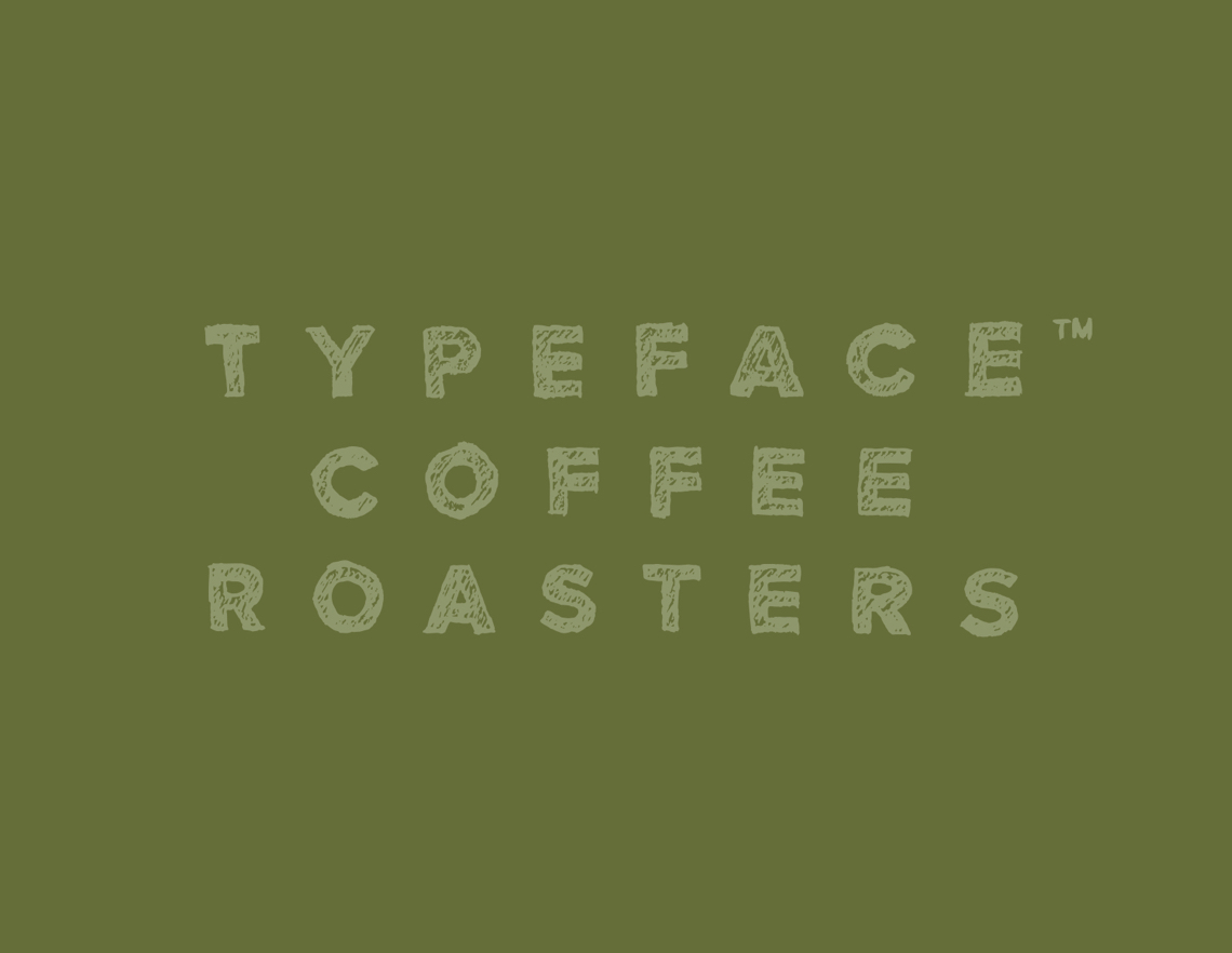


What’s This All Aboot?
(Located in pretty
Calgary, Alberta)
The small batch roaster market may be saturated, currently, but the coffee is not. Typeface is rooted in everything we do or say! It’s the style that we write, it's how we express ourselves, it's unique to everyone much like coffee is unique to every region, farmer, and individual.
Everyone is writing their story. Each has a unique experience that they’ve been through and coffee should highlight these experiences to pause and reflect. Typeface CR exists to partner with you in pausing.
The Approach
“Do I have a name in mind? Why yes, I do. We want to call it 'Typeface.'”
This totally freaked me out. As a design shop, the name Typeface means so much to my everyday existence. How would I even begin to develop an identity for it? What follows are some of highlights to my discovery of the final developed and accepted mark and further collateral carried out. It was birthed out of some great conversations and explorations with Paul, the Founder and Lead Roaster.
To create an inspiring visual voice that fuels creativity.

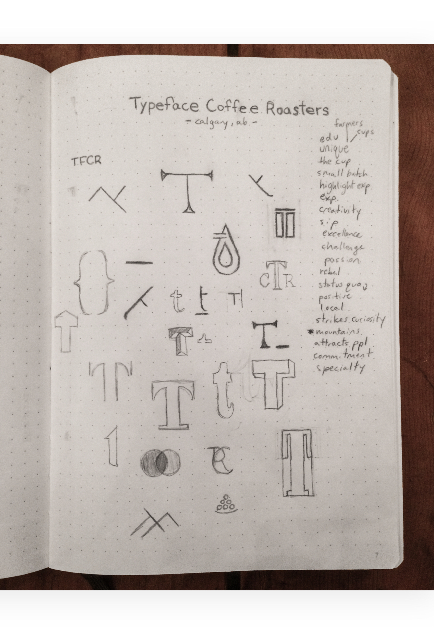
The Concept
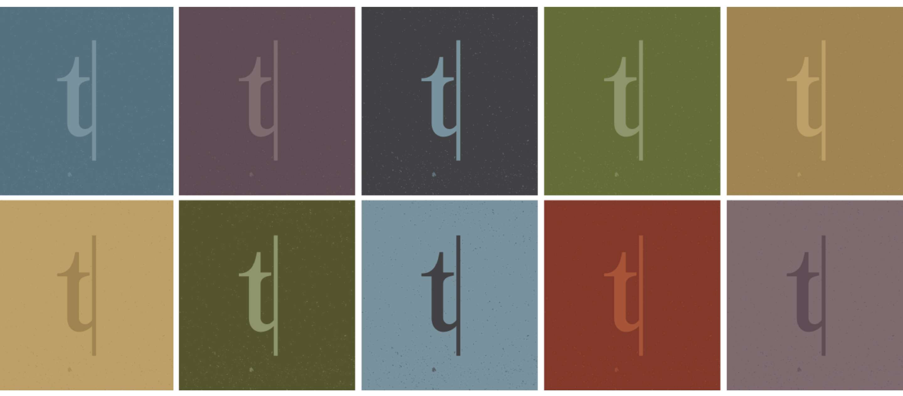
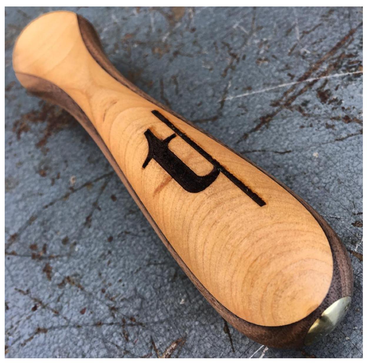
Beauty in simplicity is this logotype and mark’s cry. Representation of the name “Typeface” shown as the letter “t”. The letter “t” is lowercase to show a certain approachability and humility. The line is a starting-line for life. As we all have a blank canvas, our story, that we get to create, Typeface helps you create space for your thoughts, your relationships, your life.
The mark is straightforward as to identify with the meaning of the word “typeface.” Such a recognizable word, visually, demands a straight forward yet unique visual representation.
The Anatomy
This use of the lowercase “t” is the only place in the brand where we use a serif type. It conveys the officialness of creating and spelling out ones thoughts.
The choice to use this specific “t” comes with consideration of relate-ability. People to relate to it and recognize it immediately as a form of friendliness and invitation.

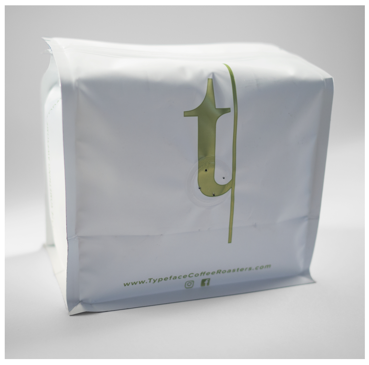
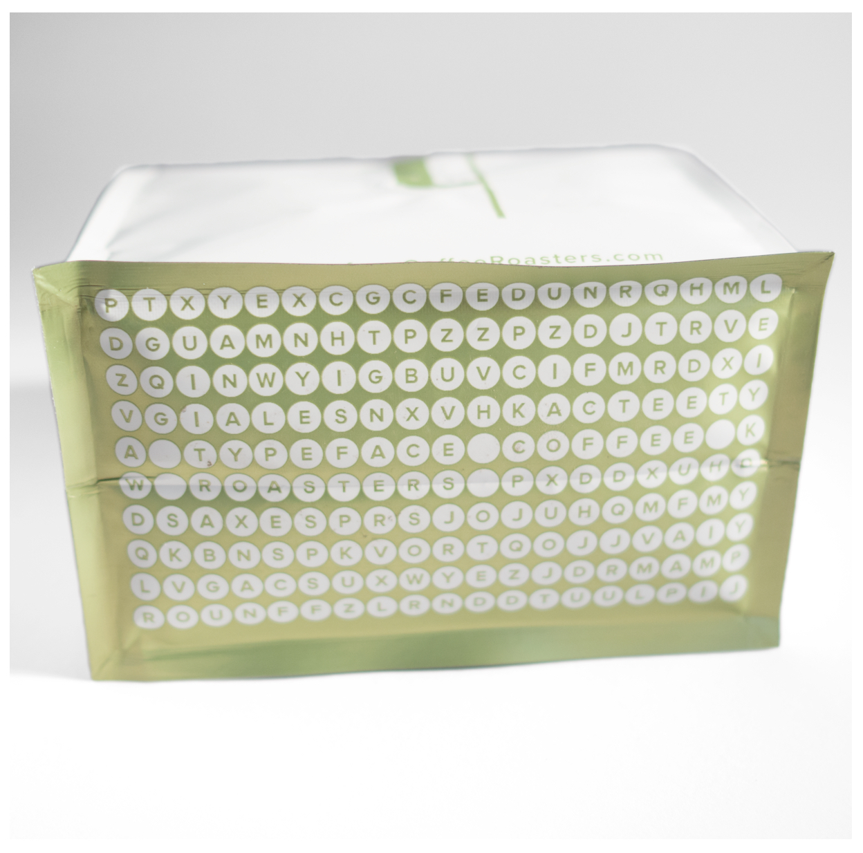
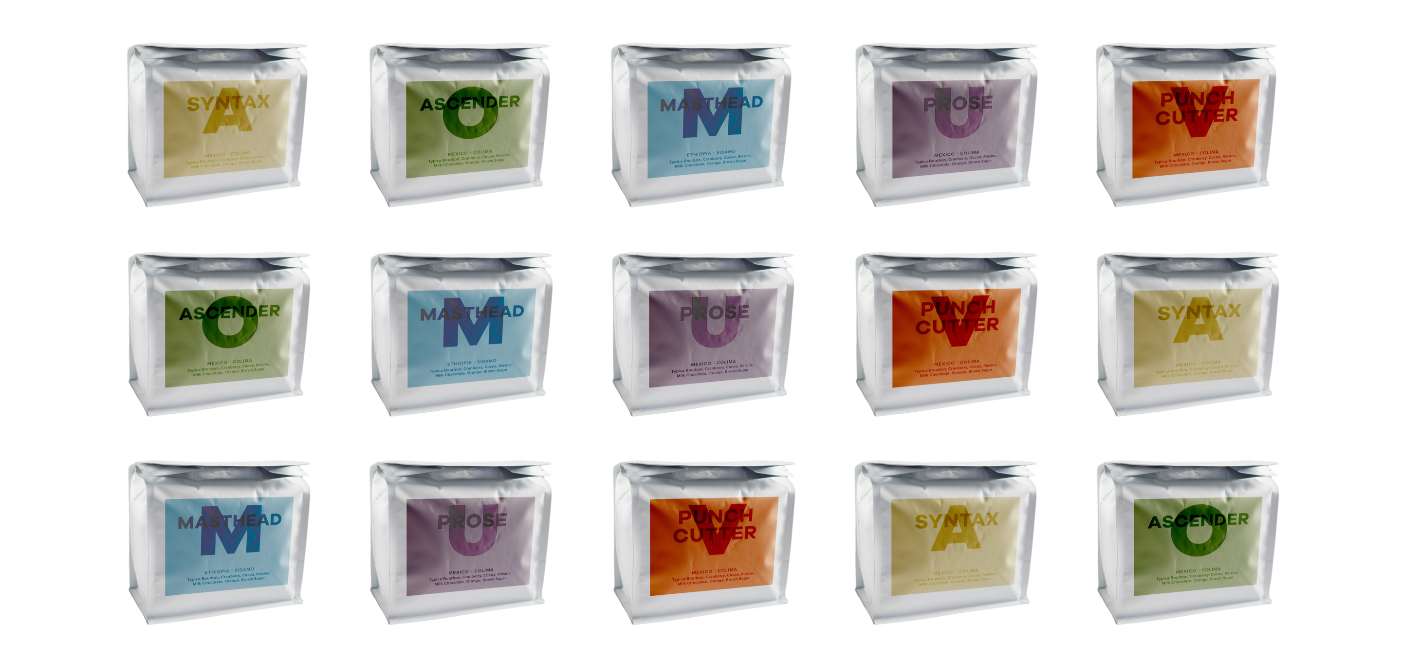
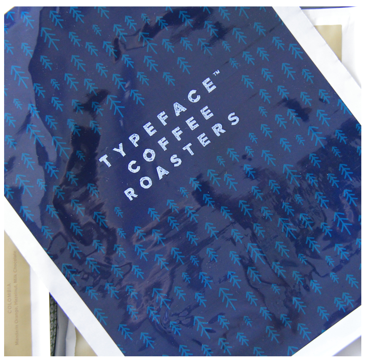
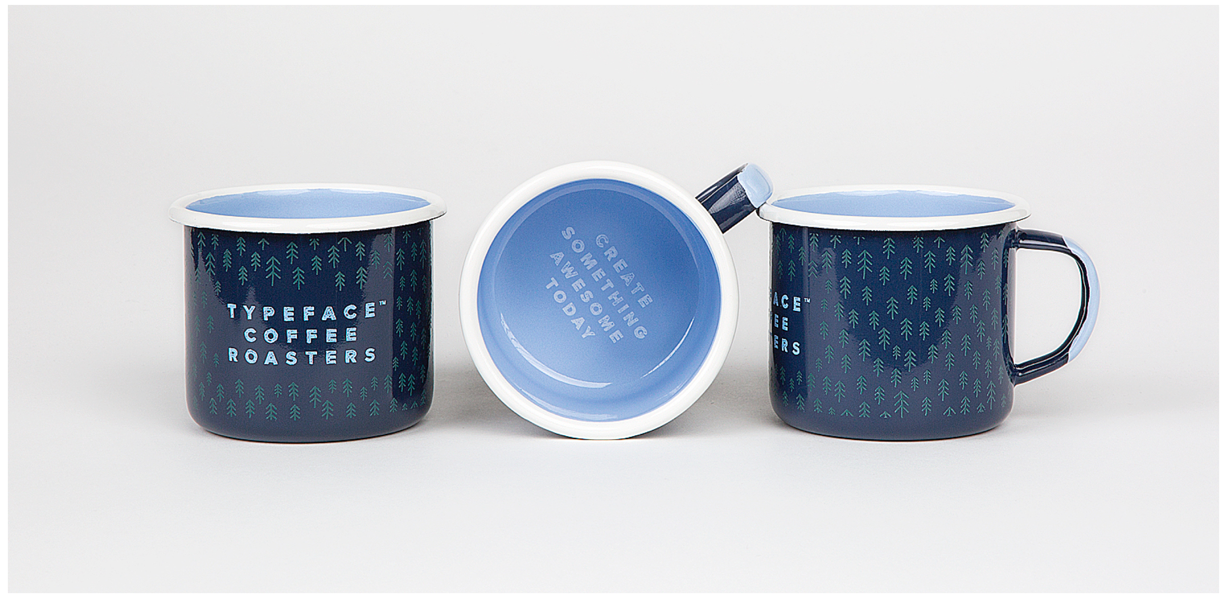
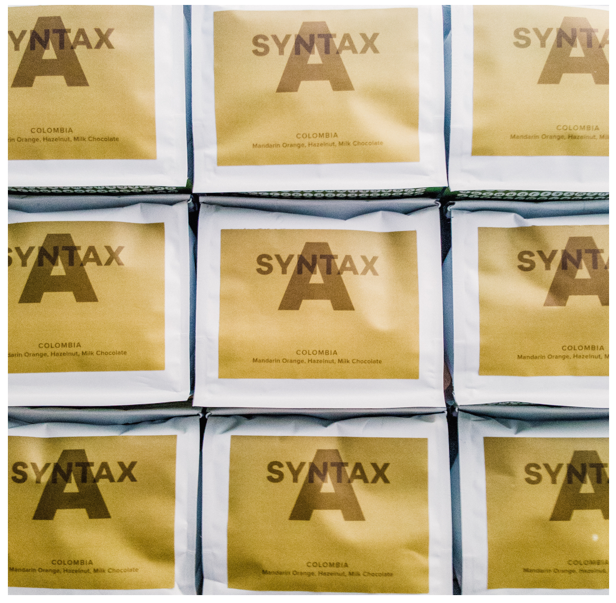
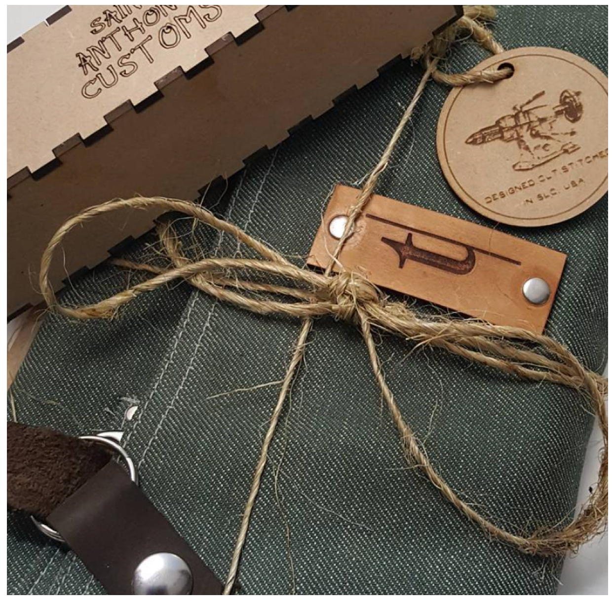
PACKAGING & COLLATERAL
I really wanted to bring the brands complimentary colors into the packaging while also developing a clear system for delivering key information on each bag. The details and information are key to consumers trusting a coffee. The design also needed to carry the weight of future versions of coffee working in that same system. It needed to look really good too :wink-face:
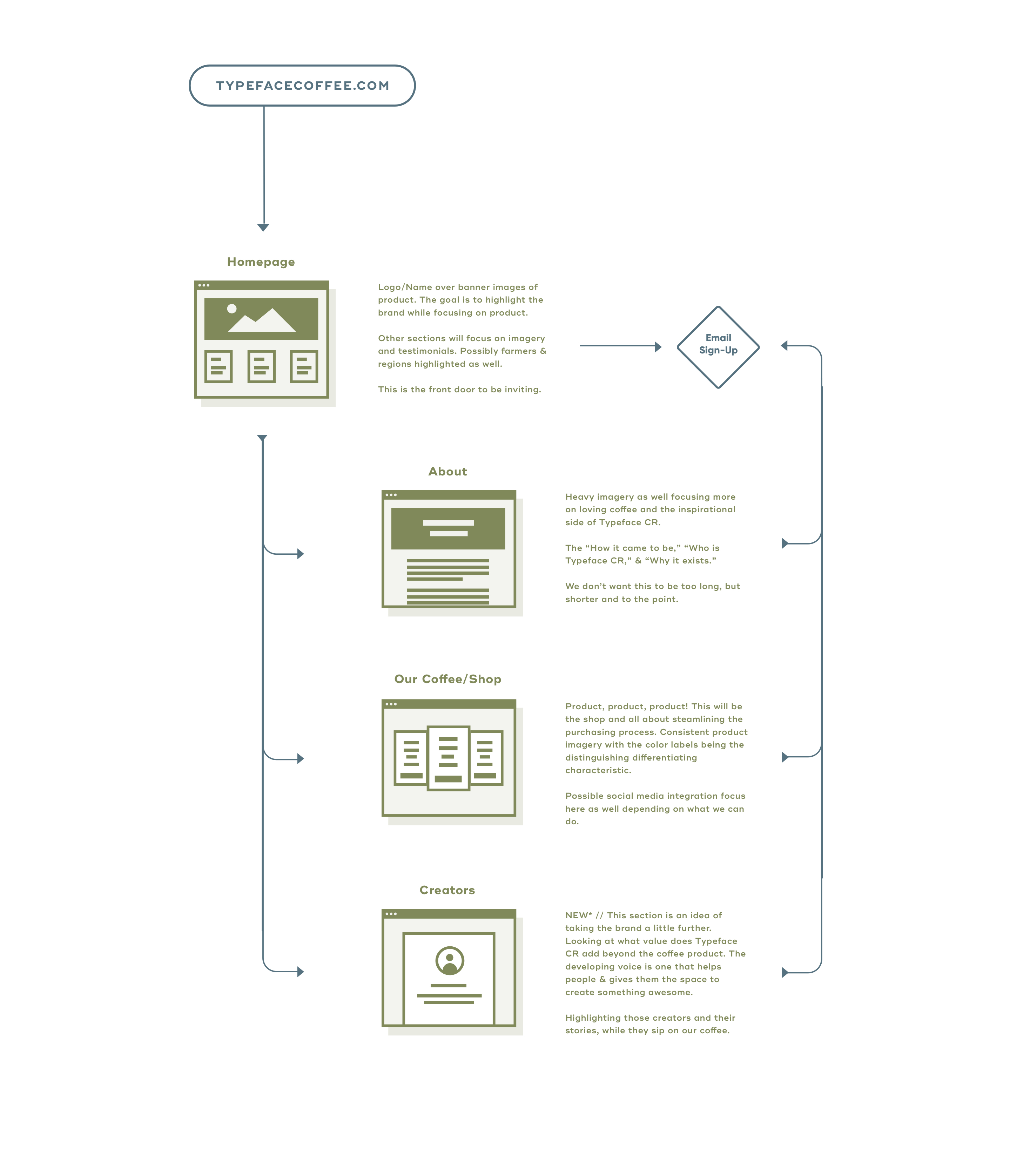
UI & UX DESIGN
It is not enough that we build products that function, that are understandable and usable, we also need to build products that bring joy and excitement, pleasure and fun, and, yes, beauty to people’s lives.
DON NORMAN
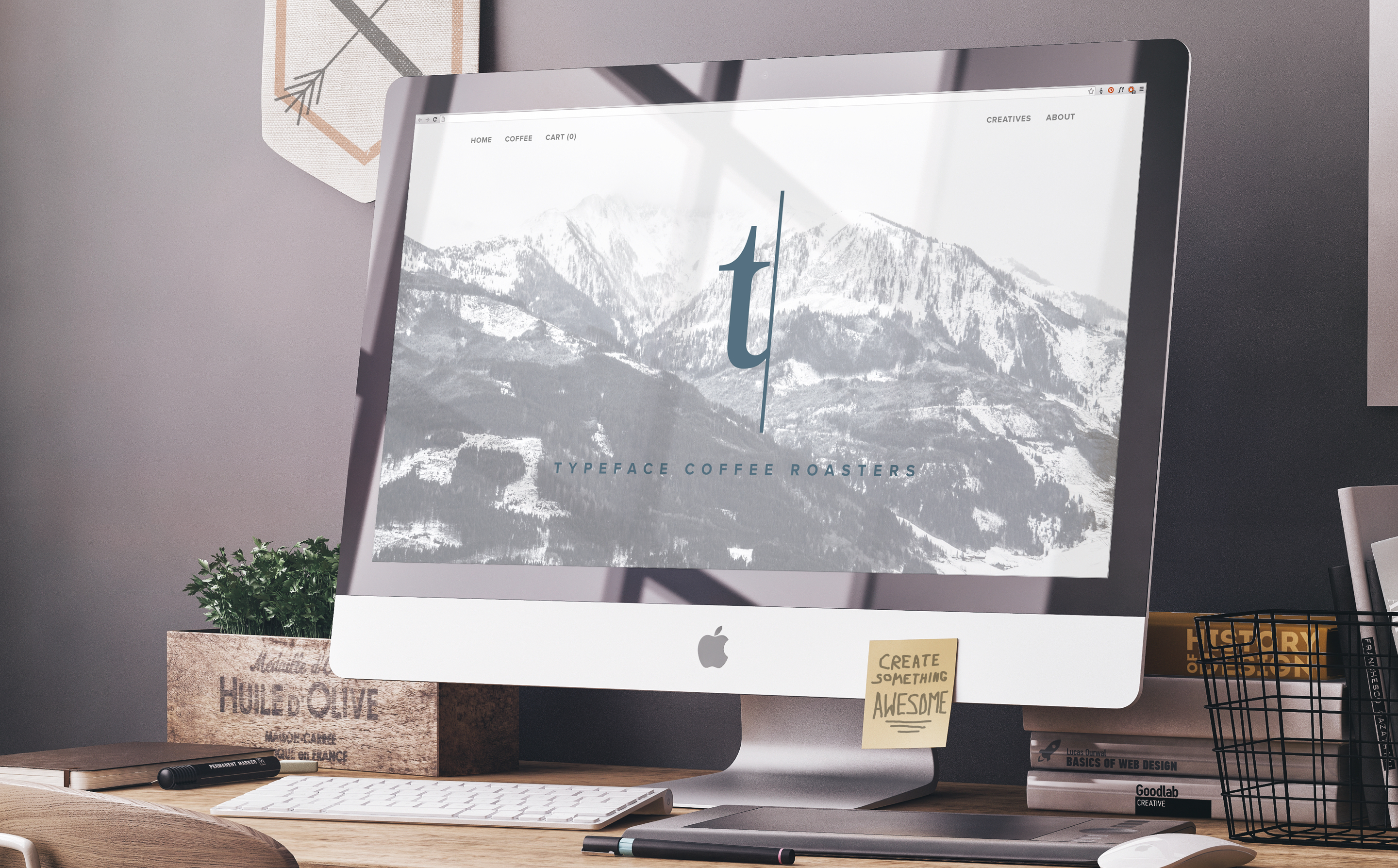
"The website could have been something really difficult for me. Instead, Stephen and Subtrction made the difficult easy for me.”
PAUL CARMICHAEL
OWNER & LEAD ROASTER - TYPEFACE CR

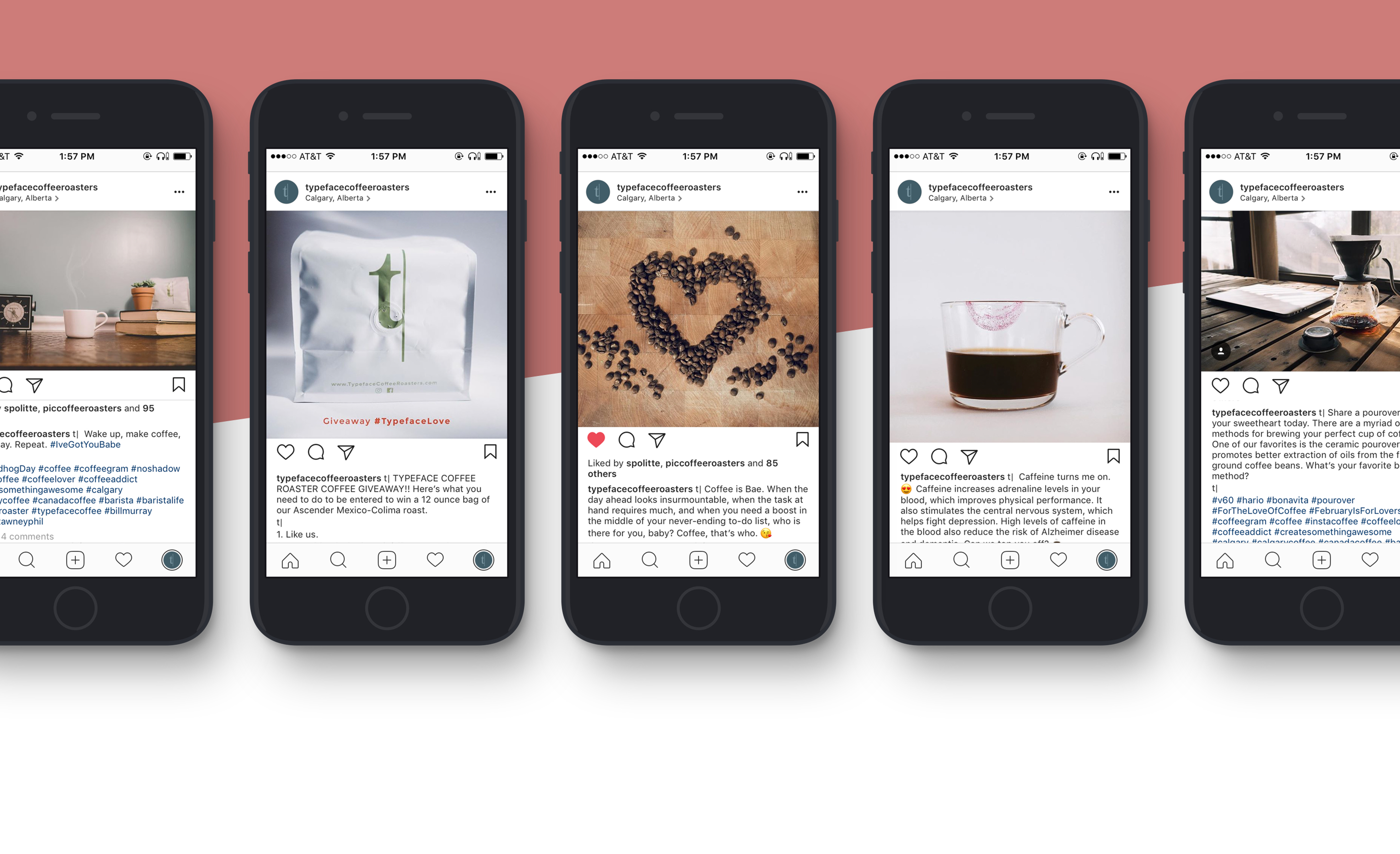
SOCIAL MEDIA
CONTENT STRATEGY
My goal was to develop a social content strategy that launched the product’s exposure and awareness while establishing its voice and tone. This helped gain a loyal base of followers and supporters. Plus, some of these are pretty dope :muscle:
Scope of Work
Discovery & Strategy Services
Evaluation
Research
Concepting
Branding Strategy
Planning
Branding Services
Branding Strategy
Visual Identity & Assets
Lettering
Collateral
Brand Guidelines
Communication Services
Communications Style Guides
Messaging, Voice, & Tone
Internal Company Materials
Content Strategy & Production
Product Naming
Packaging Design Services
Evaluation
Research
Concepting
Branding Strategy
Product Photography
UI/UX Design Services
User Flow Mapping
Content Strategy
User Experience Strategy
Wireframing & Prototyping
Visual Design
Responsive Design
Copyright © Not to use without written permission by Stephen Politte (All rights reserved)
More Selected Projects
Subtrction is...
Subtrction is the personal design shop of Stephen Politte. I partner with the most talented writers, designers, and communication specialists to craft elegant solutions to your roadblocks from strategy to execution for brands, agencies, and start-ups.


FIND US HERE
stephen@subtrction.com
314-320-489(eight)
Medium
AWESOME STUFF
www.hooke.ca
www.homesteadfolks.com
The Power of Habit
STAY UP TO DATE
Sing up to receive updates on our latest work and thoughts.
© 2020 Not to use without written permission by Subtrction LLC or Stephen Politte (All rights reserved).