Design To Represent
Us? What!?
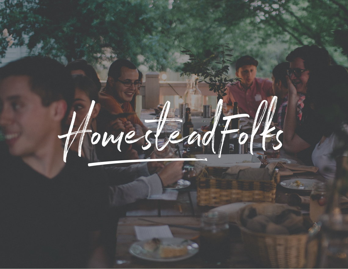
As a Marketing/Advertising Design Agency, full of talent, it’s always a challenge to design something for yourself. I hear this time and time again. It's tough to objectively look at your own identity and design to it, but it's trust to give it to someone else. This amazing Agency came straight to me (Stephen) to see if I could help them make sense of all the work they had, but needed to organize and highlight themselves in a way that is true to who they are. I love working with this Agency and their work shows their talent and expertise. I am glad I got to be part of displaying it in an egaging way.
Services Provided
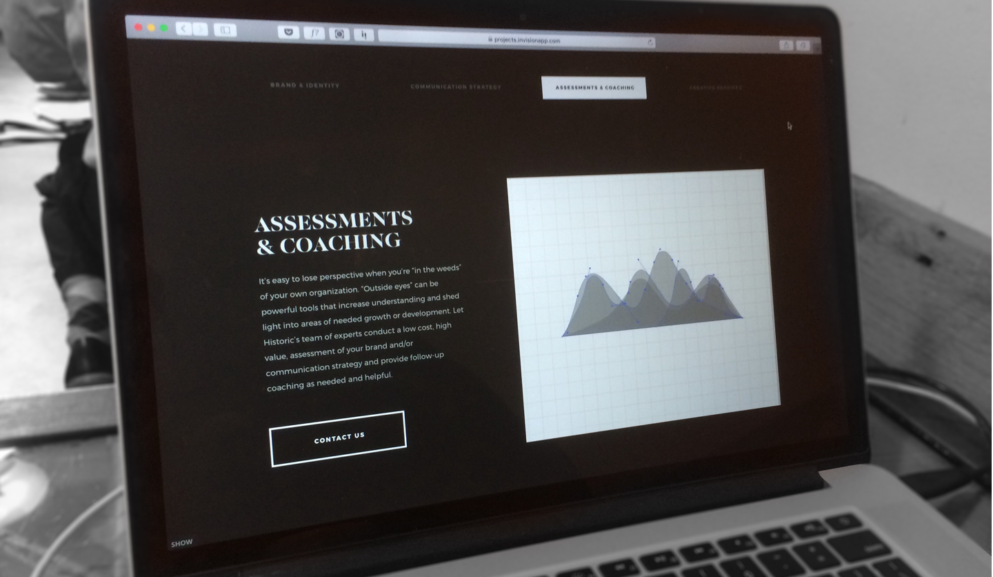
UI/UX Design
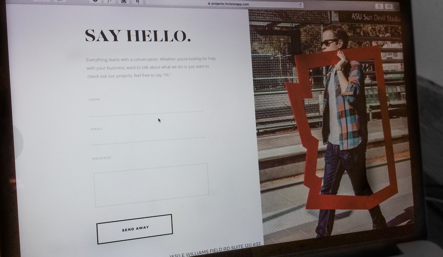
Web Design
Poster Design
Editorial Design
Change of Plans
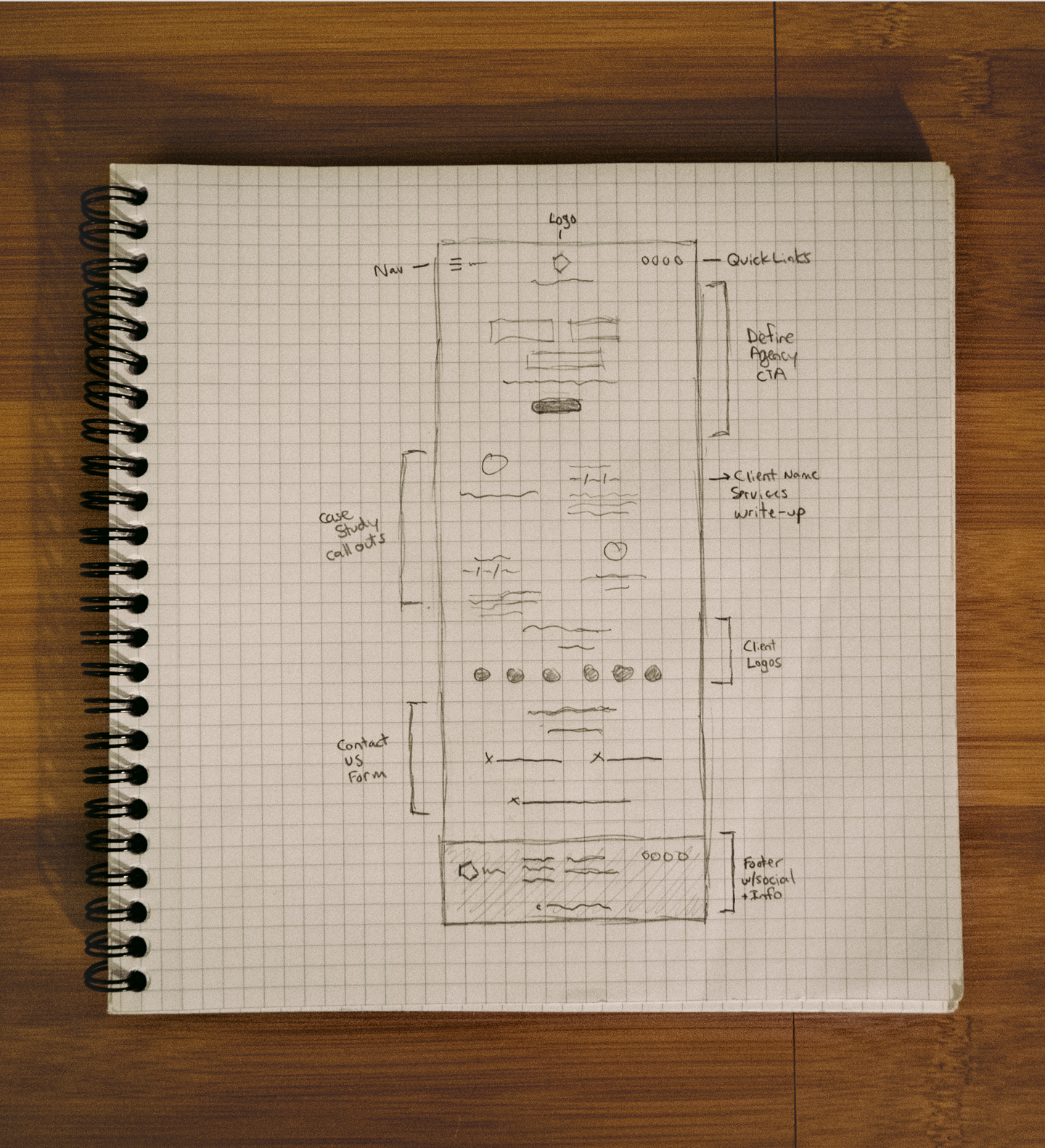
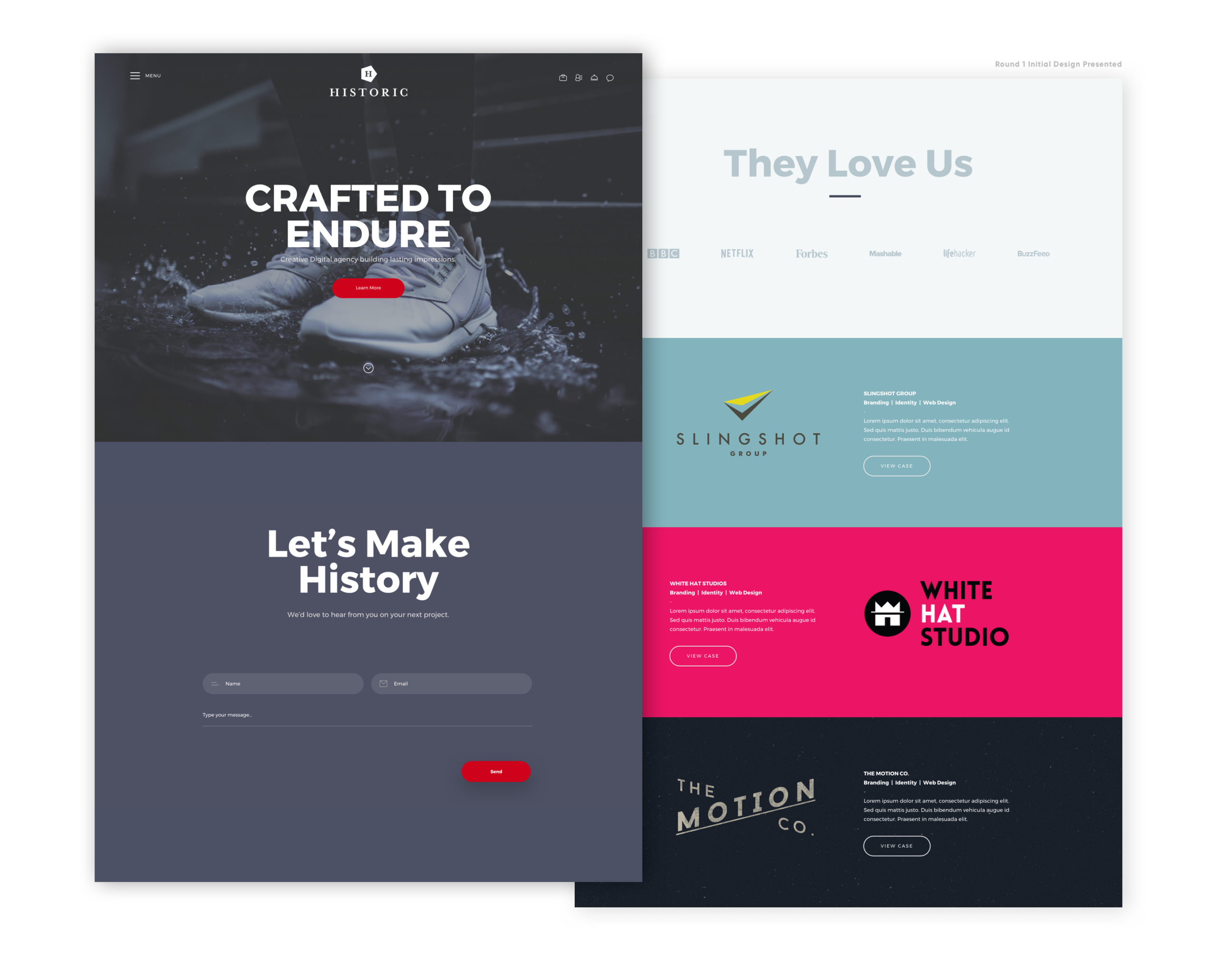
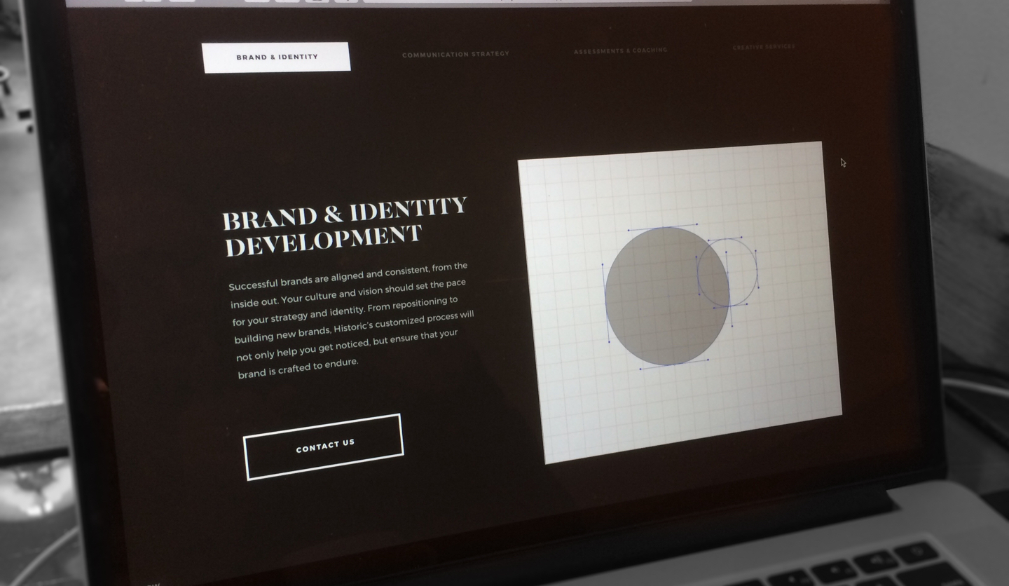
I thought we were on the right track with round one, but like all good things, it wasn't and would take some refining. In round one, a contributing goal was setting a colorful tone for the overall design. I wanted to use the primary brand color as the accent in the user interface while using the clients primary brand colors as the background color for the case study call-outs. This would help create a unforced colorful website adding a certain personality I wanted to convey. All this in mind while keeping a very clean and inviting format.
But… even though direction and design can make sense it can still be a miss on what the client is wanting and needing. Here was the imediate feedback from the Creative Director/Partner:
“I like the vibe, but I would love to have a bit more white space. All of the collateral was designed to have a super clean, minimal look. I would love to see that reflected a little bit in the homepage and throughout.”
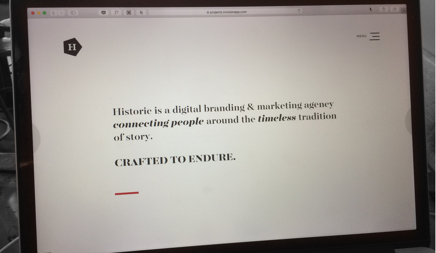
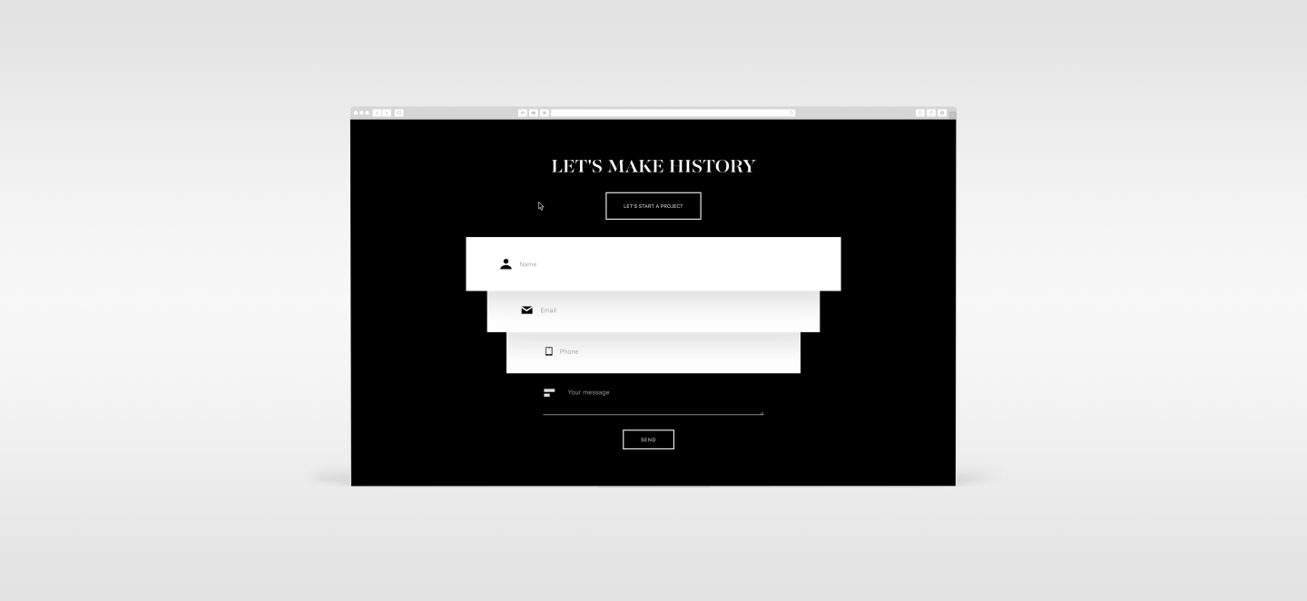
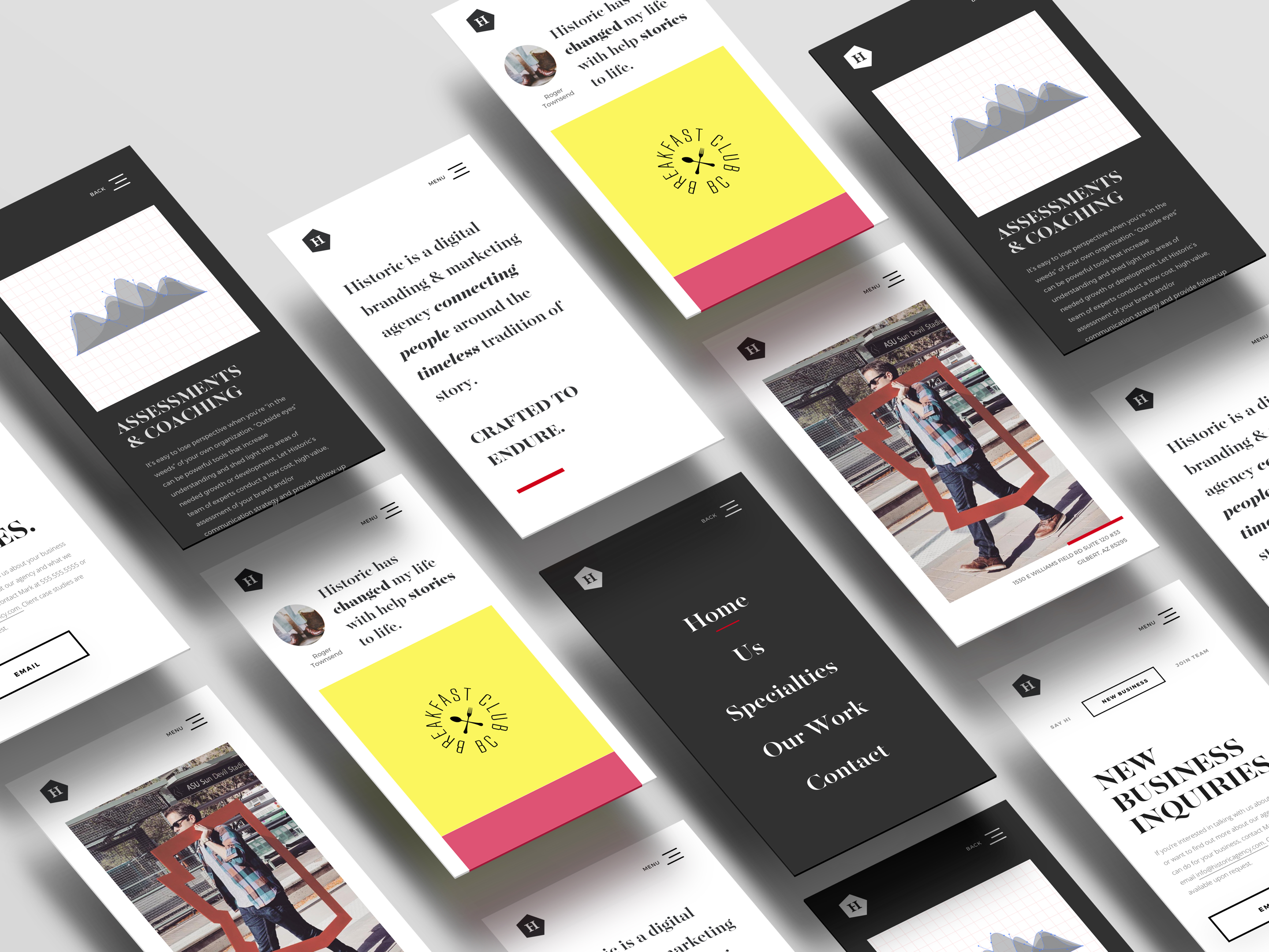
Needless-to-say, I needed to shift gears and quite quickly, of course. After some further discussion with the partners I felt good about the direction we needed to head. What follows represents a successful turn in direction and execution.
“Nice. I think it’s on the right track.”
“Love it!”
“Cool—looks good”
“Looks good”
“I like this. Let me dive into a little bit.”
“Nice work :)”
PULLED FROM SLACK
The Historic Team’s Qutoes
From the Design
PRINT DESIGN
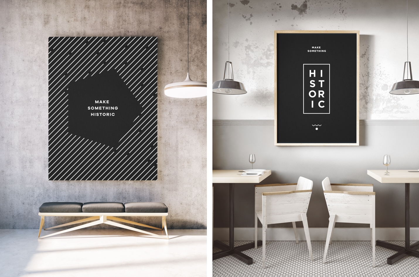
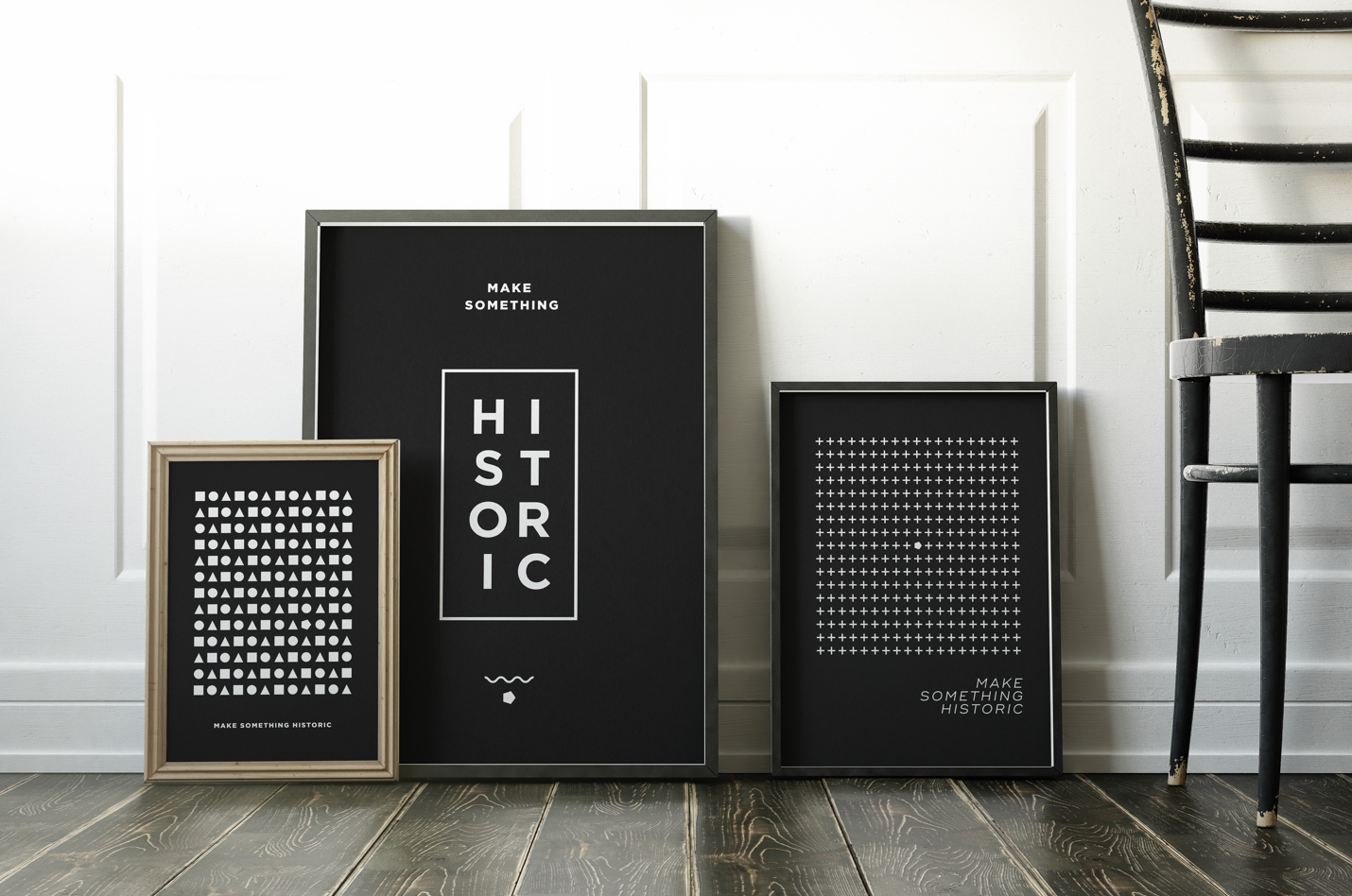
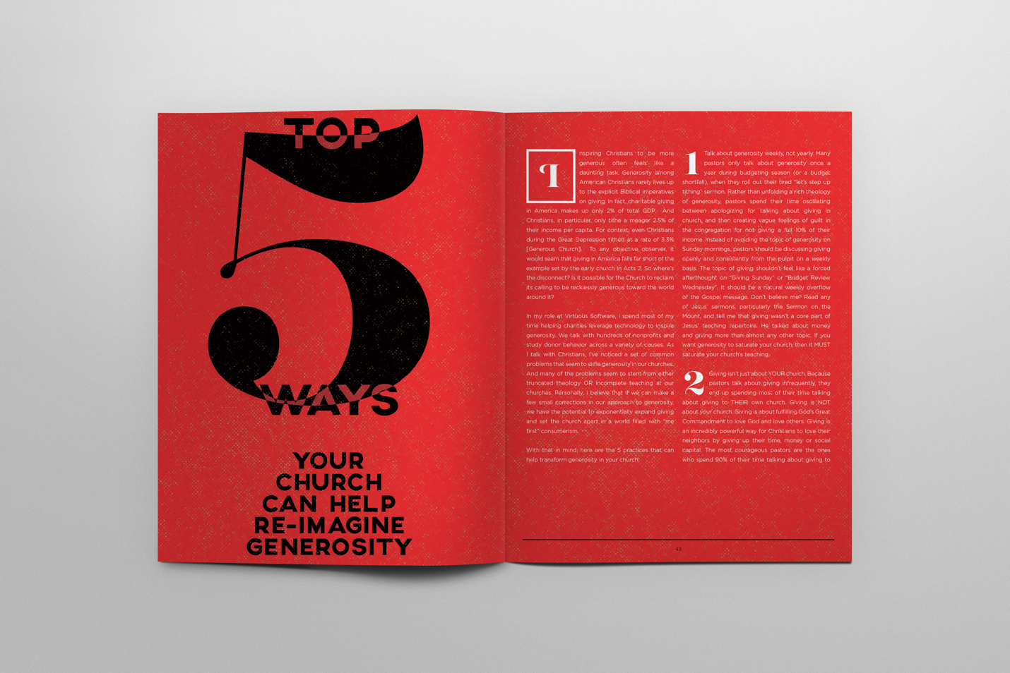
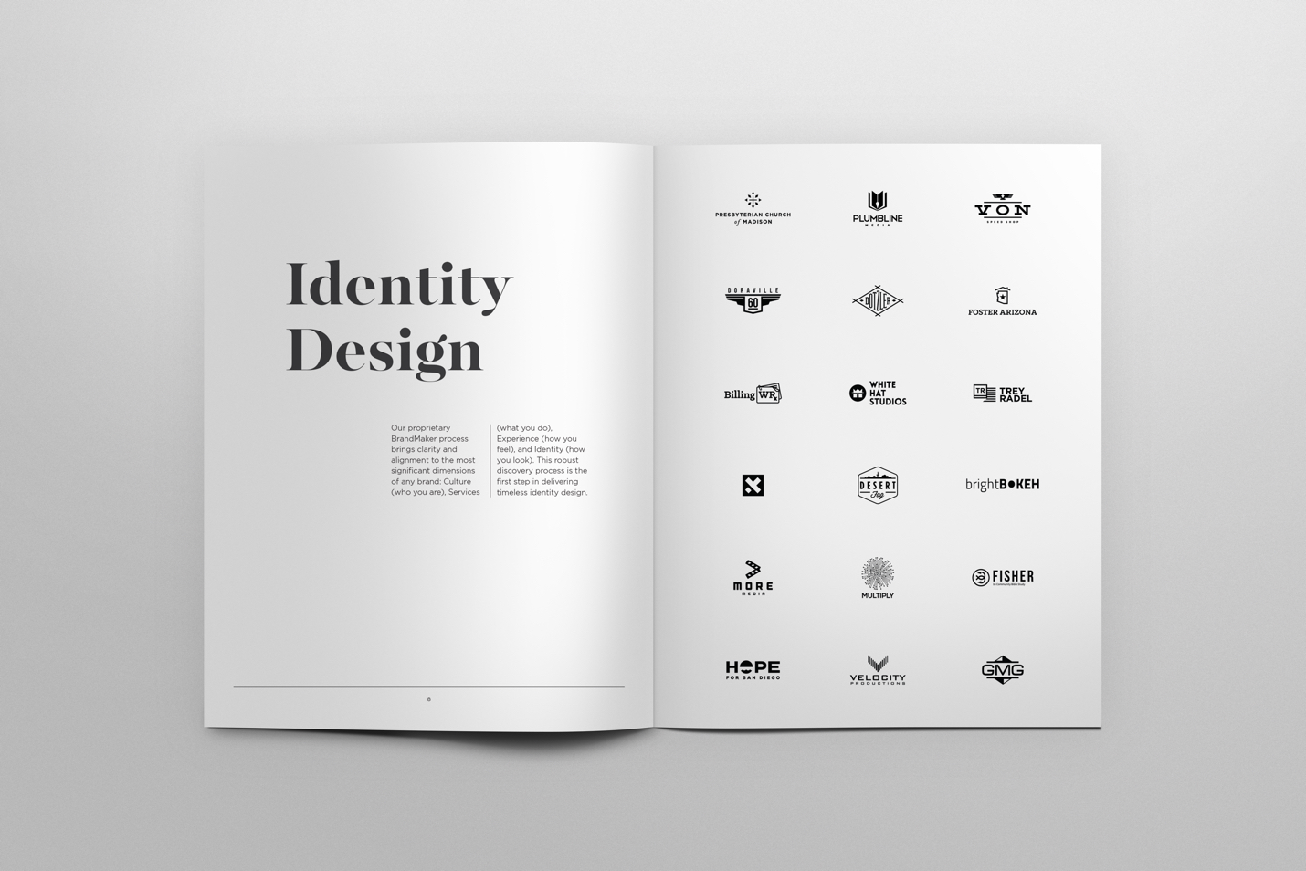
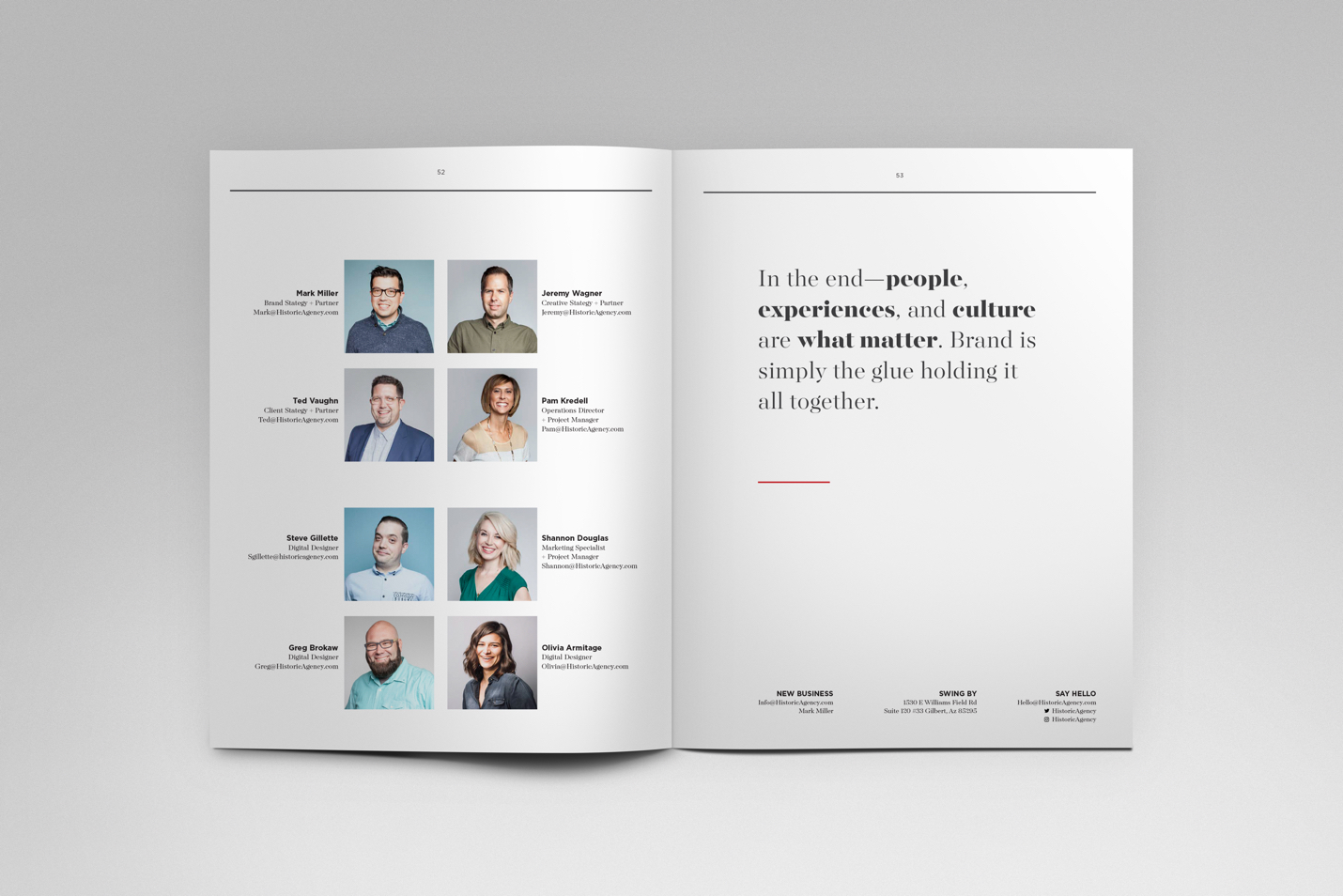
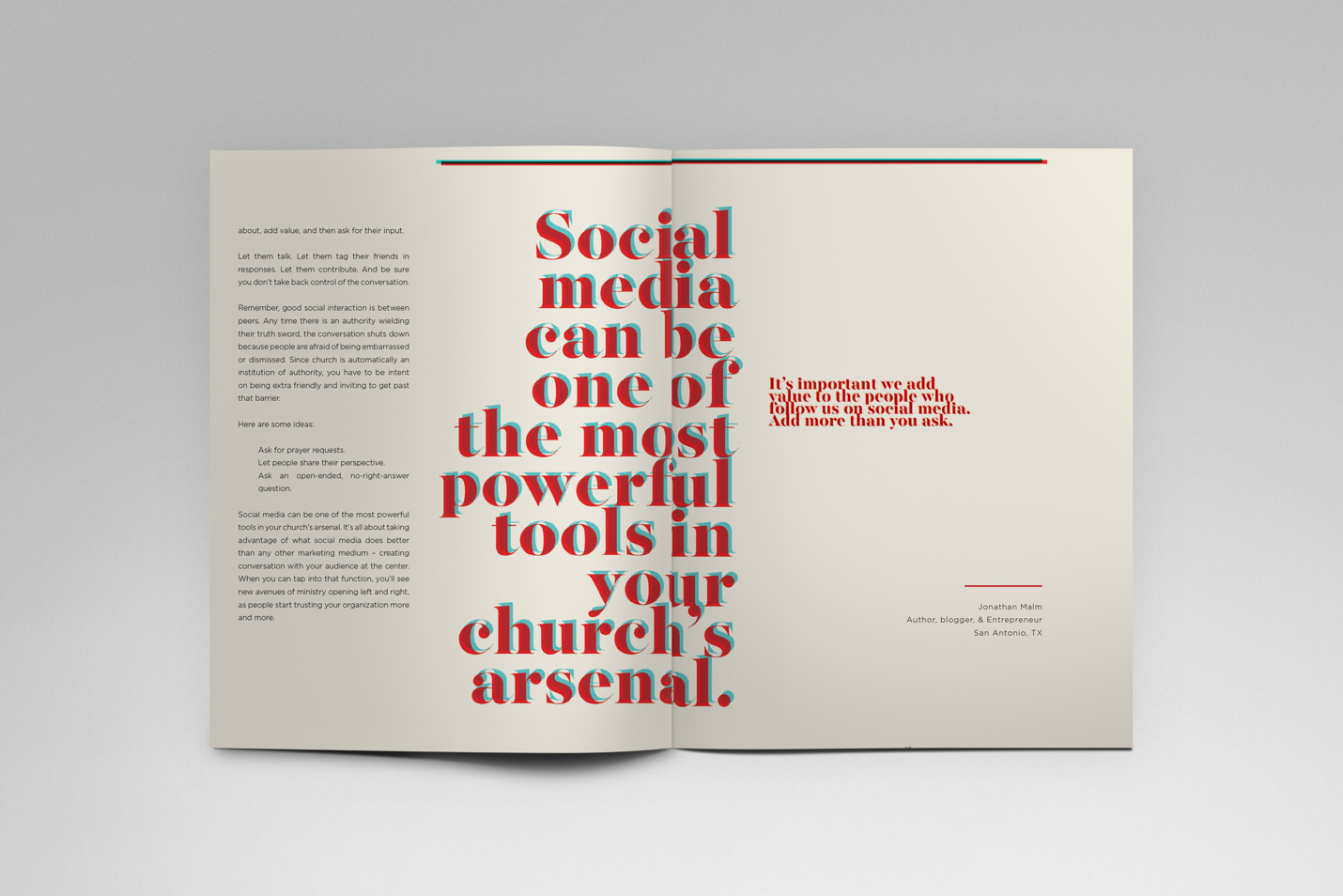
There's still something about being able to touch and hold a printed piece of design. It's impossible to replicate that experience digitally. This is why I still love designing for print. In keeping with Historic’s minimalistic approach to convey the strong subtleties of their profound mission of creating something historic, I needed to create and communicate these characteristics through the design of some posters and their work shown in a beautiful editorial piece for their Lookbook. I LOVE :heart: editorial design!
What follows are a few rounds later (16 rounds on the Lookbook), of some snapshots of the finals accepted.
Scope of Work
UI/UX Design
User Flow Mapping
Content Strategy
Wireframing & Prototyping
Visual Design
Responsive Design
Poster Design Services
Concepting
Print Materials
Environmental Considerations
Poster Design
Editorial Design Services
Communications Style
Voice & Tone
Internal Company Materials
Custom Artwork Creation
Layout Design & Execution
Copyright © Not to use without written permission by Stephen Politte (All rights reserved)
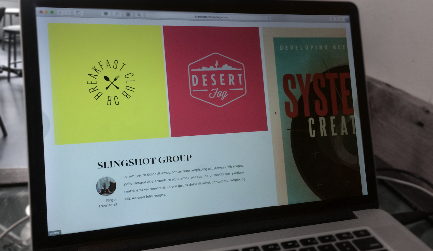
More Selected Projects
Subtrction is...
Subtrction is the personal design shop of Stephen Politte. I partner with the most talented writers, designers, and communication specialists to craft elegant solutions to your roadblocks from strategy to execution for brands, agencies, and start-ups.


FIND US HERE
stephen@subtrction.com
314-320-489(eight)
Medium
AWESOME STUFF
www.hooke.ca
www.homesteadfolks.com
The Power of Habit
STAY UP TO DATE
Sing up to receive updates on our latest work and thoughts.
© 2020 Not to use without written permission by Subtrction LLC or Stephen Politte (All rights reserved).